my Journey with The Art of Photography course…
July 21, 2009
Hi. My name is Robina and I live in both Yorkshire and Spain.
So, what is this blog all about? Well, I am studying The “Art of Photography” photography course with The Open College of the Arts. This blog will (hopefully) track my progress.
I am not a seasoned photographer by any stretch of the imagination! Talk to me about F Stops and Aperture Settings etc….. and I am as lost as an elephant plodding up the M1! But I do love taking photos!
I have a Panasonic Lumix DMC-FZ18 camera. So it’s goodbye to Intelligent Auto Mode and hello to Manual!
Under Catergories you will find my project and assignment posts and my diary will log the trials and tribulations and my overall thoughts whilst studying.
So, wish me luck…… and here I go………..Robina x
natural light: project 38
June 26, 2010
measuring the intensity of light
The brief for this project was to take hourly light meter readings with a shutter speed of around 1/125th of a second from early morning to evening on a bright sunny day then collate the information and draw up a graph to illustrate how the brightness of light during the day gradually increases, then levels out, and then decreases. With my Panasonic DMC-FZ18 camera this proved to be a challenging task! Firstly, I had to set a shutter speed of 1/40sec in order to attain an aperture of F3.6 to be able to allow the camera the capacity to decrease the aperture as the brightness of the day increased. Secondly, my camera has a limited aperture range of F2.8 – F8 therefore as the day progressed the shutter speed had to be changed a further two times in order to gain scope for the aperture scale.
Below are the readings that I registered at hourly intervals in the shade as well as in the sun – the shade readings were taken out of curiosity rather than being part of the brief. I did not attempt to make a graph as I felt that the numerous changes of shutter speed readings would make this task rather complicated!!!
SUN
7.30 am 1/40 sec F3.6
8.30 am 1/40 sec F5.6
9.30 am 1/40 sec F8.0
10.30 am 1/400 sec F4.5
11.30 am 1/400 sec F5.6
12.30 pm – 4.30pm 1/400sec F8.0 ( levels off )
5.30 pm 1/400 sec F7.1
6.30 pm 1/400 sec F5.6
7.30 pm 1/400 sec F5.0
8.30 pm 1/125 sec 3.6
SHADE
7.30 am 1/5 sec F3.6
8.30 am 1/5 sec F4.5
9.30 am 1/5 sec F6.3
10.30 am 1/5 sec F8.0
11.30 am – 3.30 pm 1/60 sec F4 ( levels off )
4.30 pm 1/30 sec F5
5.30 pm 1/30 sec F3.6
6.30 pm 1/15 sec F4
7.30 pm 1/6 sec F3.6
8.30 pm 1/4 sec F3.6
what I have learnt
(a) To be aware of the movement and it’s pattern of the brightness of light during the day.
(b) The confirmation that a limited aperture range has limitations in the extremes of lighting conditions.
natural light: project 44
June 26, 2010
low sun
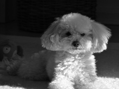
This project demonstrates the qualities that can be achieved in an image when shooting in low sunlight.
Back lighting

The image above was taken in the hills of Marbella. I shot towards the light and bracketed the exposure . The selected image has a -1 stop bias which emphasizes the beautiful effect of the sun’s light on the summer grass by obscuring further the foreground to the left of the shot. Also, the reduction in exposure assisted in adding a soft warmth from the sun’s rays.
Frontal lighting


natural light: project 41
June 26, 2010
your eye’s sensitivity to colour
The images below, taken from projects 32 and 33, are arranged in such a way to illustrate their order within the spectrum. Also, the curve formed by the images illustrates the eye’s sensitivity to colour – the colours that are darker are lower within the graph and those which are lighter are higher.
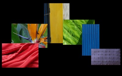
Radio waves, x-rays, radar and light are all electromagnetic radiation that are invisible to the eye with the exception of light which (because of the sensitivity of the human eye) is visible. Radiation is defined by wavelength and visible wavelengths are the colours of the spectrum.
Mixing all these colours together ( which our eyes do ) results in white light. Sunlight is the standard not only for brightness, but for colour. In the middle of the day sunlight seems colourless and we call it white light. Light becomes colour when some parts of the spectrum are missing. An example of this is when the sun is setting. On a clear day and dependant on the weather conditions as the sun starts to get lower in the sky it becomes yellow, lower still and it becomes orange. The best of sunsets are red when touching the horizon. The reason for this is that all the particles in the atmosphere scatter some of the light – and there is more atmosphere between you and the sun at sunset. The shorter wavelengths get scattered more easily leaving the longer ones visible. It is the blue that gets scattered, so what remains looks orange or reddish. The blue wavelengths that have been scattered makes the sky away from the sun look blue.
The possible colours of daylight can be red, white and blue. Photographic manufacturers make filters to alter the colour of light in order to achieve the desired colour of daylight.
The colour of the sun from white to red can be given a figure ( in degrees of temperature ) which is useful for calculating what filters to use. This is called the Kelvin Scale – starting at the lowest possible temperature called absolute zero.
What I have learnt
The awarness of the variety of outdoor light.
natural light: project 39
June 21, 2010
using faster film and higher sensitivity
ISO denotes how sensitive the image sensor is to the amount of light present. The higher the ISO the more sensitive the image sensor and therefore the possibility to take pictures in low-light situations. An ISO of 100 is generally accepted as ‘normal’ and is used in good lighting conditions such as a bright sunny day. In low light conditions, such as a cloudy day or indoors, the sensitivity of the image sensor can be increased to 400 or even higher. Taking photographs in low-light conditions with a higher sensitivity will allow you to shoot without an unwanted flash or handhold the camera as oppose to using a tripod. Using my bridge camera I shot the following pictures using an iso from 100 up to 800:-
100 100


200 200

200 400


400 400


400 800


There is a price to pay when using a higher sensitivity and using a higher sensitivity with my bridge camera proves to be a pretty high price. The shots taken with an iso of 100 and 200 have a reasonably good quality, anything above that sensitivity and the images are flat and grainy under close inspection. When using my camera in very poor lighting conditions, such as indoors, the noise is unacceptably prominent.
what I have learnt
The use of a higher iso with my bridge camera is not at all successful.
N.B. Having read reviews on various DSLRs and their iso capabilities, I believe that if I had used a DSLR my findings would have been much more positive.
natural light: project 45
June 21, 2010
picture count
Below are 4 photographs that I found on the internet that show the lighting directions discussed in project 44:-
Back Lighting

Frontal Lighting

Side Lighting

Edge Lighting

Below are 10 photographs from the course’s textbook where I felt the lighting was of prime importance:-

Kurt Benning ‘Musicians’ Platform in a German Farmhouse’ 1975.

Manuel Alvarez Bravo ‘ El Umbral’ ( The Threshold ) 1947.
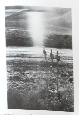
Robert Frank ‘ Crosses on Scene of Highway Accident – U.S. 91, Idaho’.
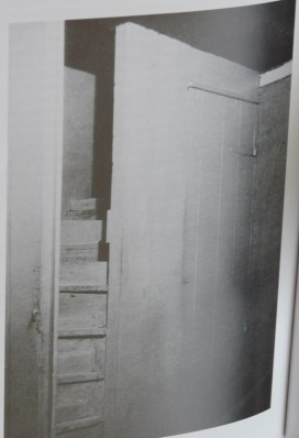
Charles Sheeler ‘Interior’ 1917.

Robert Demachy ‘Academie’.
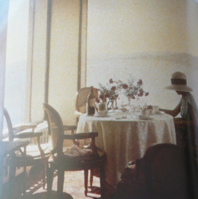
Jacques Henri Lartigue ‘ Bibi au Restaurant d’ Eden Roc, Cap d’Antibes’ 1920.

Manuel Alvarez Bravo ‘ Verde ‘ ( Green ) 1966.

William Henry Fox Talbot ‘ The Open Door ‘.

Hippolyte Bayard ‘ Garden Tools and a Straw Hat ‘ 1843 or 1844.

Emmet Gowin ‘ Edith. Danville, Virgina, 1971’
what I have learnt
The recognition of the many uses of light in photography.
my diary: post 12
May 27, 2010
Before undertaking a photography course one needs to consider the time, effort, and focus one will need to successfully complete the course. What one doesn’t consider, and indeed, what one is unable to foresee, are the adversities that life can throw at you. The losing of my dad knocked me for six! The passion and the love that I have for photography was suddenly suppressed by a profound feeling of sadness and negativity. Over the past few weeks the unrelenting love and understanding that I received from family and friends have guided me through the darkest of moments to a point now where I am again embracing happiness, and controlling the negative feelings of sadness. In the next couple of weeks I intend to review the projects that I have already completed in order to reinstate the focus and determination that I had and that is required to successfully complete The Art of Photography course.
I will be posting the next projects over the next couple of weeks.
Robina x
my diary: post 11
April 27, 2010
Email to my tutor;-
Hi Norman,
Since returning to Spain at the end of February my life has been extremely gruelling both physically and emotionally. My father who has been suffering ill-health for many years took a turn for the worse and was admitted to hospital. After leaving hospital my mother, Julian and I cared for Dad at our villa as he needed 24 hour care. After a few weeks of tender love and care we were delighted that my father was making progress. It is with great sadness that I have to inform you that my father suffered another major stroke 2 weeks ago and passed away a week later.
For many weeks now my camera has been unused. I am hoping that in the near future my life will return to some kind of normality and that I will be able again to focus on my studies, and again enjoy my passion for photography.
Robina x
The response from my tutor was that he totally understood what I was going through. He also added that I should take my time with the course and to continue when I am ready.
assignment 3: applying what you have learned so far
March 7, 2010







colour: project 34
February 17, 2010
black-and-white and grey as colours
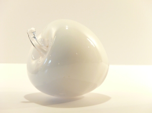
This project examines the importance of accurate exposure settings for the three neutral colours black, white and grey. The following photographs show the results of taking white, black and grey subjects at various exposures;-
White
As camera meter reading +0.3 stop


+0.7stop +1stop


+1.3 stop +1.7stop

+ 2 stop

The photograph of the white apple which was taken using the camera’s meter reading has a very strong grey colour. It is evident that as the exposure bias increases the grey dissipates. The photograph that was taken with a +2 stop bias has a purer white and has the truest representation of the white glass apple.
Black
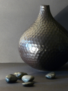
As camera meter reading -0.3 stop

-0.7 stop -1 stop
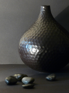

– 1.3 stop – 1.7 stop


– 2 stop

In the above shots of the black pot, the reducing of the exposure increases the purity and the depth of the neutral colour black.
Grey
As camera meter reading + 1 stop


– 1 stop – 1.7 stop


+ 1.7 stop

The photograph above of the grey shell, shot with an exposure bias of + 1.7 , captures the purity of the white background and the various tones of grey and black in the shell. The smaller photographs of the shell shot at various exposures illustrate that when capturing objects of neutral colour it is important to consider exposure experimentation. For example, the picture shot using the camera exposure reading does not show the lighter tones of the grey in the shell, and the white background and foreground are too dark.
Notes
1. Both the black, grey and the white shots were taken in my kitchen using basic desk top spot lights.
2. A tripod was used for the shoot.
3. No consistent colour bias evident.
4. Experimentation using colour correction filters will be undertaken at a later date.( My current camera does not have the capacity to apply the successful use of filters).
5. A hand-held light meter to measure incident light was not available.
What I have learnt
The importance of exposure experimentation when shooting the neutral colours black, white and grey.
natural light: project 50
February 12, 2010
Rain
The prospect of undertaking this project was very much an unwelcome one. Taking photographs in the damp, cold and wet is not my idea of a fun time as a I am very much a sun and warmth lover! Yet, I must say that it was a project that I very much enjoyed doing! The thoughts of the horrid murky day and the coldness of my hands and feet were very quickly put to the back of my mind as I soon discovered the captivating visual effects brought about by the rainfall.
Below are a few of the photographs that I took . I used an iso setting of 200-400 :-

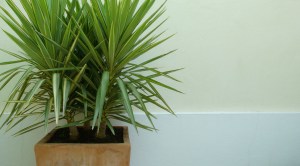
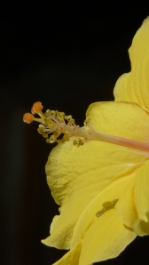
The raindrops on the yucca flower add dapples of magnification on the flower’s petals.

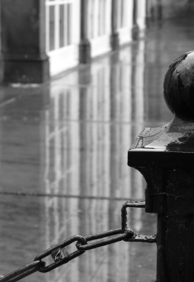
Glossy black links and droplets of rain on the iron chain emit the sense of coldness on a rainy day.
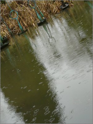
The pretty ringlets on the pond have a captivating effect.

The reflection of the glass on the wet yorkshire stone adds interest and depth.

In this shot I feel that one gets a real sense of the damp murky day.
The reflections of the windows give a striking effect.

The reflection of the headlight on the wet road and the illuminated rain against the car, again gives the atmosphere of the rainy day.
What I have learnt
Photographical oppurtunities can be found in many different weather conditions.
colour: project 31
February 11, 2010
colour library
white




Natural


yellow


orange


red


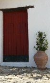


blue

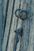


green

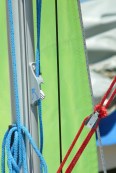


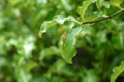
Grey/Black


my diary: post 10
February 10, 2010
I am pleased to say that I am again working on my photography studies! Mega doses of antibiotics are attacking the extremely stubborn abscess in my parotid saliva gland, and hopefully they will succeed in destroying the beast!
So having arrived in the UK at the beginning of December I am now preparing for my return to Spain on Feb 22nd ( 5 weeks later than originally planned). The time spent in the UK gave me the opportunity to take photographs of the snow! As mentioned previously, there is a beautiful park very close to where I live. The day after the first major snow fall I went into the park and took some photos – here is the link to my Snow Wonderland album:- http://cid94296c11d4816960.skydrive.live.com/browse.aspx/Snow%20Wonderland. It looked so amazingly beautiful. I had a magical couple of hours there – me , the snow and my camera…. bliss! But my goodness, it was extremely cold!
So, it’s back to Spain! Where project and assignment work beckons! Being in the UK over the winter months has certainly made me realise how fortunate I am to be able to do the project work during the winter months in the much sunnier and milder climate in Spain! My fellow students in the UK must find it extremely difficult to organise and plan outside photography for the project and assignment work when the weather is often so cold, wet and dark! I take my hat off to them!
my diary: post 9
January 23, 2010
I thought that I should just write a quick post to explain why my blog has been so quiet recently!
On December 24th I awoke to find a large swelling under my left ear lobe. After a number of visits to the doctor and various hospitals I was told that I had a tumour in my Parotid Salvia Gland! A month of worry and pain was very much alleviated yesterday when an Ulltra Sound Scan and a Needle Biopsy revealed that a 2cm tumour in my Parotid Salvia gland is most probably an Abscess! I am actually pain-free today as the biopsy drew out gunge which has relieved the pressure on my facial nerves! I still have got to get rid of the thing which could mean a 3 hour operation! But, hey guys, feeling pretty good today!!
I am really missing my photography and studies, but hopefully in the next few weeks I will be less one very unwelcome tumour and raring to go with my studies.
Robina x
colour: project 35
December 1, 2009
colour relationships
Colours on opposing sides of the colour circle balance each other. These are the complementary pairs and they have a naturally harmonious relationship. However, to attain this harmonious connection one needs to take into account the relative brightness of the various hues. For example; yellow is about three times as bright as violet. For the twelve colours in the colour circle, there are 6 complementary pairs. Below is the brightness ratio for the three primary colours and their complementary opposite secondary colours :-
- Red – green 1:1
- Orange – blue 1:2
- Yellow – violet 1:3
The brief for this project is to take one photograph for each combination of primary and their secondary complementary opposites whilst taking into account the above brightness ratios.
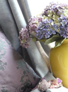
I took this shot with the 1:3 ratio in mind. I also took into account the light hues of the colour violet and therefore increased its representation in order to attain colour balance. The various hues of the violet together with the small representation of black have a visually harmonious connection against the brightness of the yellow.
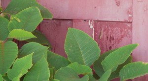
Even though the red of the door in this shot is not pure, I feel that the two colours together with a 1:1 ratio do have a complementary connection. The green of the leaf is brighter, yet there is a hint of the red in the stems and veins of the leaf which assists in uniting the two colours.

I took this photograph in a childrens’ playground in Estepona. Both the orange and the blue are impure representations. I do feel that harmony is not quite achieved here. Possibly a darker blue and an additional representation of orange to the left of the shot would have assisted in achieving the blue and orange complementary connection.
The second part of this project is to take photographs with multi – colour combinations of which at least one should be in the balanced proportions – the other images can be in a mixture of strong colours that are appealing to you:-

This image represents the 2:1 ratio of the blue and orange. The introduction of the cool green of the trees and the warm red of part of the fence helps to alleviate the imbalance between the light hue of the blue and the darker orange.
A mixture of strong colours that are appealing to me:-

I particularly like the cool colours of green and violet with the two accents of the brilliant yellow of this shot which I took in my garden in Spain. I feel that there is a pleasing colour balance within the image achieved by the subtle representation of the yellow and the brightness of the two hues of blue against the larger representation of the light hue of the green.

The pink and yellow tones of the water-lily are soft, yet together set against the strong hue of the green leaf they have a strong striking colour presence in this shot. The speckled representation of the dark maroon in the leaf set against the same, but lighter hue of the flower, assists in bringing colour harmony and charm to the image.

I feel that the striking presence of the red rope against the light hues of the blue and green gives this shot great energy.

A shot of similar colours green, yellow and orange was not in the brief of this project, but I thought that it was interesting to see the extreme contrast of colour relationships between similar colours and the images of the colour relationships that I took above.
What I have learnt
The diversities of complementary colours and colour relationships.
colour: project 37
November 25, 2009
filters with black-and-white film
Unfortunately, my Bridge camera does not have the capacity to enable the successful use of filters. In order to understand the use of filters for this project I did the following research:-
Photographers shooting in black-and-white are able to apply some selective control over tone value when using colour filters. Objects within an image of similar reflectance may have similar tone values in the resulting printed image. For example, if you had taken a shot of an apple tree and the red of the apple and the green of the tree had similar reflectance, they might be almost indistinguishable in tone in the resulting final composition. The table below illustrates the lightening and darkening effects of different colours that can be achieved when using various coloured filters in black-and-white photography:-
| Filters Commonly Used in B&W Photography* | |||||
| Filter** | Filter Factor |
f/stop Increase |
Filter Effects | Lightens | Darkens |
| Medium Yellow 8 (K2) |
2x | +1 | Probably the most widely used. Offers an accurate tone range in compensating for the blue sensitivity of panchromatic films. Will slightly darken sky and increase contrast between blue sky and clouds. Also may help reduce haze. | Yellow, Chartreuse, Olive, Red, Pink, Orange, Lime Green | Blue, Violet, Purple, Lilacs |
| Deep Yellow 15 (O) |
2.5x | +1 1/3 | Stronger effect than medium yellow. May darken sky considerably | Yellow, Chartreuse, Olive, Red, Pink, Orange, Lime Green | Blue, Violet, Purple |
| Red 25 (A) |
8x | +3 | Produces very dramatic skies. Effects may border on the surreal. Darkens foliage. Reduces haze. | Reds, pinks, magentas, some browns, yellow, orange | Blues, greens, cyan |
| Green 11*** | 4x | +2 | Lightens foliage and will darken skies somewhat. Sometimes used to produce pleasing skin tones in portraits | Yellow, yellow-green, olive, greens | Blue, violet, magenta, red, maroon |
| UV | 1x | 0 | Absorbs UV radiation and will reduce distant haze or fogginess | ||
| Polarizer | 2.5x | +1 1/3 | Helps remove reflections and glare. May cut pollution haze. Darkens sky. | ||
| Grad ND | n/a | n/a | Reduces the amount of light reaching a part of the image — usually used to darken the sky. | ||
filter table from www.fineart-photography.com/bwfilter.htm
The Filter Factor shown in the table is the exposure compensation required when light is absorbed which necessitates an increase in exposure.
Useful notes when using filters
- A filter may affect several of the objects in the image, not just the one that you are concentrating on.
- Filters come in different strengths and it is a good idea to use the least amount of filtration that will accomplish your goals – heavily filtered shots can be visually harsh.
- Experiment- shoot images with and without a filter, bracket exposures and try different filters.
Useful learning material
www.ephotozine.com/article/Using-coloured-filters-with-black–white-film-4828
my diary: post 8
November 19, 2009
It is Assignment time, yet again! Over the past couple of weeks, as well as the project work, I have been working on the write-up for Assignment 2 ( instead of doing it at one fell swoop,which I did with Assignment 1). I am almost at completion – spreading the work load over a few weeks is certainly more manageable and does alleviate the stress factor! As usual, the lack of confidence and the doubts are surfacing in my mind – could I have done a better job with the assignment, are the shots that I took for the assignment the type of shots that my tutor is looking for…….. and so on! So, its fingers crossed and onwards and upwards ( as my friend and fellow student Marty would say ).
In my diary post 4. dated September 7th, I wrote that in doing the course I was learning a great deal about the composition of a photograph, yet the more that I learned the more that I had to remember which was producing a lack of fluency and aptitude when taking a photograph. Two and a half months have passed since then, and time and practise have corrected all that! Now, when looking through the viewfinder for a potential shot, the knowledge of the fundamental framing principles along with the knowledge of the various elements of design which assists in creating balance and harmony within a shot are becoming more second nature to me. This increase in aptitude is rewarded by a satisfying and enjoyable ” at one” experience with my camera and ( hopefully) better shots!!!
The more that I use my Bridge camera the more that I realise its limitations. Don’t get me wrong, I think that it is a great little camera (it takes decent quality pictures and it’s small enough to fit in my handbag which is great when travelling so much), but I do feel that the limitations of the small aperture range (f2.8 – f8) does stifle artistic creativity. Also, I do feel that a higher picture quality would be nice. But, for now, I feel that it is doing the job adequately in launching me into the world of photography.
assignment 2: colour
November 18, 2009
3: elements of design. project 26
November 9, 2009
real and implied triangles
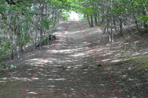
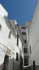
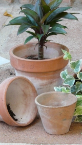
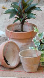
Triangles of one kind or another can be found photographically in many places. Moreover, a complete triangle is made up, obviously, of 3 sides and 3 corners, however, even 2 sides will give the impression of a triangle, provided they penetrate far enough into the picture. Also, if one side runs parallel with an edge of the frame then a triangle using two diagonals can be formed. Using diagonals in an image create a sensation of activity and dynamism because of their construction of diagonal lines. My pictures below illustrate both real and implied triangles.
Real triangles
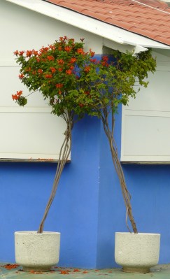
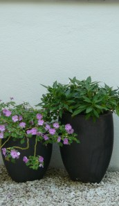
This image was taken in Estepona. The harbour bar in which the two potted plants were placed had most probably closed for the out of season months and the plants had been placed in the triangular fashion, most probably, to secure them against the coastal winds. Symmetry is very evident within the image along with the dynamic impact of the diagonal lines which also lead the eye to the colours of green and red of the foliage. All these elements of design within the image give an overall visually pleasing effect.
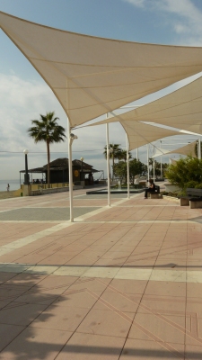
Estepona’s impressive promenade radiates dynamism with the linear effect of canvas triangles.
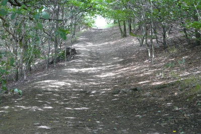
Having a low perspective when taking the shot of the woodland path shows the diagonal lines converging thus creating a triangle.
Once again, because of the low perspective, an inverted triangle pointing towards the centre building adds order to the image and directs the eye to the main point of interest.
Implied triangles
The forming of the triangle in the still- life arrangement gives a sense of order to the image.
The combination of the horizontal lines of the terracotta bricks in the background and the inverted triangle pointing towards the bottom of the frame gives a striking effect to this still-life image.
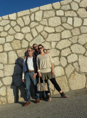
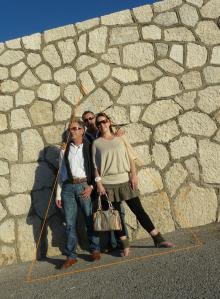
The forming of the triangular shape in this group picture of my family gives the shot design and structure.
What I have learnt
Triangles give activity and dynamism to an image together with design and structure.
Colour: project 33
November 8, 2009
secondary colours
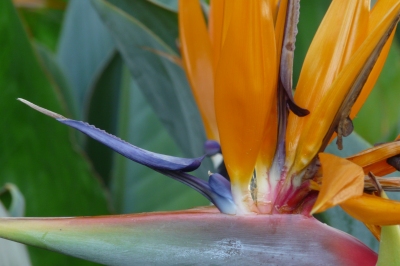
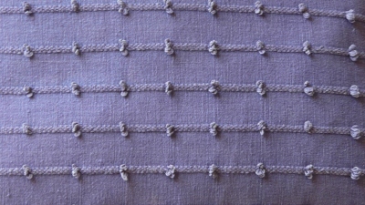
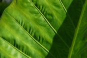
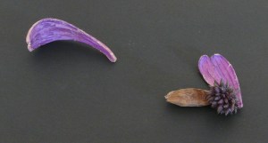
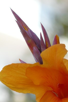
Secondary colours, orange, violet and green are each a mixture of 2 primaries. Orange is a mixture of red and yellow and has some of the fiery, intense qualities of red as well as the brightness of yellow. Violet is between red and blue, a rich, deep and subtle colour. Green is a mixture of blue and yellow and has many variations. Below are the images that I took to capture the qualities of the secondary colours. I varied the exposure for each of the images representing the three colours and then selected one exposure ( the larger illustration) that I considered to have the correct strength of colour:-
” Bird of Paradise” exposure bias -0.3 step
exposure bias 0 step exposure bias +0.3 step
“Cushion” exposure bias 0 step
exposure bias -0.3step exposure bias +0.3 step
“Large Leaf” exposure bias 0 step
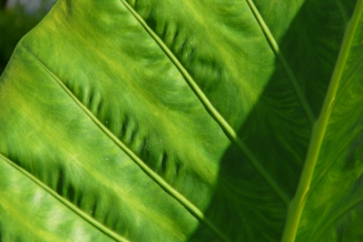
exposure bias -0.3 step exposure bias +0.3 step
what I have learnt
The appreciation of the strength and qualities of the secondary colours orange, violet and green.
Colour: project 36
November 8, 2009
warm and cool colours
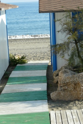
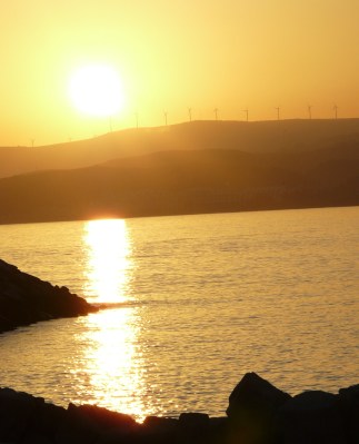
The strongest division of the whole colour circle is that of the contrast between warm and cold. It is generally accepted that the coolest and warmest range of colours are, respectively, blue-green and orange-red. Below are the images that I captured to illustrate the qualities of warm and cool colours :-
I took this image of the beach huts at Estepona to illustrate the cooling effects that are emitted by the calm blue sea,which is highlighted by the blue of the beach hut. The green wooden walkway and the shadows also add a calm, cooling effect to the image.
The sunset at Estepona Harbour displays the unmistakable warming effects of the combination of orange and yellow.
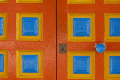
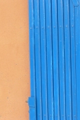
The colourful door shows the cool-warm contrast – blue against orange and yellow.
What I have learnt
The appreciation of the indisputable qualities of warm and cool colours.
Colour:project 32
October 31, 2009
primary colours
Photographic primaries are the additive colours red, green and blue (RGB), yet the primary colours that are most commonly accepted in perception are red, yellow and blue ( known as painters’ primaries). In our perception these three colours seem to be the most distinct from each other. For this project I took a number of images of the colours which I felt were good representations of the three painters’ primaries at different exposures then ascertained which of the various exposures were the closest in strength to the OCA colour wheel guide.
Red
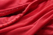
For the colour red I decided to experiment with all the exposures available to me on my camera. The pictures below of my red top were all taken on a tripod, the camera settings were, manual, iso 400, shutter speed 1/4 sec. My camera’s exposure recommendation with the above settings, was an aperture of f5/6.
f/3.6 f/4 f/4.5
f/5 f/5.6 f/6.3
f/7.1 f/8
Looking at the above pictures I was surprised to see that each exposure shows qualities of the strength of the vibrant red. Yet, the exposure at f/7.1 has the vigour and the level of strength that I was looking for and that is portrayed in the colour wheel.
Blue
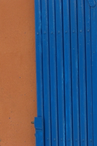
The 3 pictures of the blue door were taken on a manual setting, iso 100, aperture f/5.6 and the exposure bias as indicated.
0 step -0.7 step +0.7 step
I feel that the centre picture of the blue door with a -0.7 exposure bias step is the true representation of the actual colour of the door and the colour blue that I wished to present as the painters’ primary blue.
Yellow
Finally, the images of the yellow painted door were taken on a manual setting, iso 100,aperture f/5.6 with the exposure bias steps as indicated.
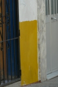
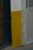
0 step -0.7 step +0.7 step
The third picture with a + 0.7 exposure bias step is the strength of yellow that I have chosen to represent the painters’ primary colour wheel, yet I do feel that this representation of yellow is slightly degraded.
To summarise, the three images below are the strength of the colours red, blue and yellow that I have chosen for this project:-
What I have learnt
The appreciation of the strength and qualities of the painters’ primaries red, blue and yellow.
elements of design: project 28
October 31, 2009
rhythm and pattern
Forms of repetition in photography, as in rhythm and pattern, have a very strong appeal to the viewer. There is a visual beat to pictures containing a repetitive theme as there is a musical beat in music. Visually, repetition can be expressed in two ways: as rhythm and as pattern. Rhythm can be experienced by the movement of the eye following the repetition of a regular continuation of attractive lines and shapes while pattern is essentially static and has to do with area (spatial repetition):-
The rhythm produced by the repetitive shapes within the black iron frame leads the eye to the street lamp.
A variation of pattern within this image adds interest.
The pretty pots are placed in an irregular form within this shot, but the sense of pattern is accomplished by their close grouping.
what I have learnt
The appealing effects that a repetitive theme emits in an image
my diary: post 7
October 22, 2009
In a few more weeks I will probably be approaching the half way mark in the course. It seems that as each day goes by the more I learn and the more that I want to learn about photography. As I mentioned in my diary post 5 great insight into the world of photography can be gained by doing this course. Also, I have found that the course has prompted me to analyse my choice of subject for potential images. This analysis of subject selection is not as much in the project work, as freedom of choice of subject is somewhat restricted by the brief for the project, but it is more about when I am taking photographs for assignments or when I am totally absorbed in the world of photography, my camera and the subject. In order to start this analysis I listed the subjects that I seem to be naturally drawn to, together with the collective qualities that these subjects/pictures often hold :-
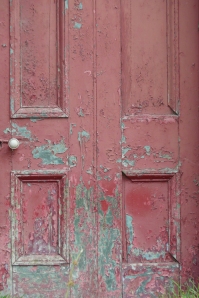
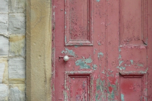
- doors; old peeling paint, dull unsaturated colours, unadorned, their framing- stone/brick.
- chairs: old or modern.
- trees; in lines, obvious shape, shadows.
- countryside; fields, grass, open space, old buildings.
- people/children; particularly the old and the young.
- animals; within natural surroundings.
- towns and cities; undeveloped areas, people doing their everyday work, ports.
Firstly, I should say that the words ” choice of subject ” are best described as a captivation of these subjects. I don’t go out with the aim of finding the above to photograph, it is rather that the subject seems to find me. Secondly, I know that I have an innate love and appreciation for light, colour and texture and these three qualities have, I believe, a great influence when my captivation for these subjects is aroused.
Among the list of seven subjects there are four( the bottom 4) of which have a very general category. A desire to photograph, let’s say, towns and cities doesn’t hold any mysteries. Undeveloped areas, people doing their everyday work and busy ports offer a great deal of interest within a photograph. I could go further with this analysis of my photographs that fit within this category by examining the common visual elements of interest within each of my photographs, but for now, this is more of a general examination rather than an examination in great depth. But, the question is why do I have this fascination in my world of photography for doors, chairs and trees? The three categories that have very defined and clear subjects.
I have always loved trees. For me their longevity, imposing stature and presence seems to hold a kind of uncanny insight into our world. I love the different colours and textures of tree barks. Trees offer us beautiful colour through the seasons and welcome shade from the burning sun in summer. I love the sprawling shadows of trees and the tree’s branches. And we must not forget that if it wasn’t for trees we wouldn’t exist! So, with this examination of my appreciation of trees and their undeniable qualities I can see why I have a penchant towards photographing trees. But, when it came to examining my leaning towards capturing chairs and doors I had to dig really deep!
Chairs often have beautiful form and shape. Chairs in a photograph evoke the thoughts of people resting and thinking – who were these people? What were their thoughts? Old doors ( which I love to photograph) have an enclosing rectangular shape. The rectangular shape mirrors the shape of the picture frame giving an image depth. Old doors can seem welcoming or can seem hostile to any outside presence. The thought of Pandora’s box comes to mind- if the door was to be opened what would be revealed? Who has or who had the key to the door. Old wooden doors often have beautiful colour and texture. Is the door that I wish to capture telling a story?
Having examined my thoughts on the qualities of doors in particular, I can better understand why I have a fascination for taking photographs of them. When I see a door enhanced with the beauty of light and texture together with the qualities of a beautiful colour and the mysterious qualities that an old door can hold, for me, I have a beautiful image with a story to tell and I know why!
So, now it is back to more picture taking and more project and assignment work.
Thank you for reading.
Speak to you later, Robina x.
elements of design: project 27
October 21, 2009
real and implied circles
In photography circles are much less easy to find than triangles and rectangles. To a great extent one has to depend on actual circular objects thus limiting their usefulness in photography. Below are photographs that I took of real circles:-
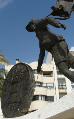
The enclosing qualities of the circle in this picture of the Boy and the Peseta are strengthened against the lightness of the buildings in the background.
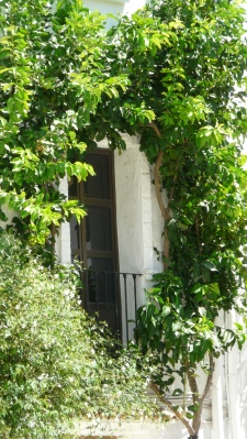
The circular shape formed by the climbing plant illustrates how the enclosing properties of the circle add very defined structure to an image.
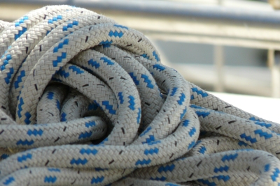
The circular shaped patterned rope gives the shot visual harmony and structure.
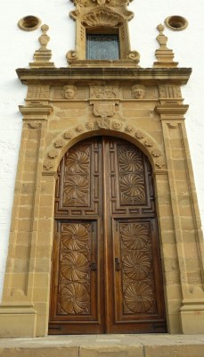
This shot, of the magnificent wooden door, taken in the town of Estepona, illustrates how powerfully the various engraved circular designs impose their enclosing structure.
The pictures below, taken from The Art of Photograph text book, shows implied circles being used in photography:-
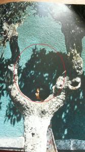
Manuel Alvarez Bravo ” Verde” 1966.
The shadow on the background wall together with the curvature of the tree trunk form the implied circle which beautifully highlights and encases the girl’s profile.
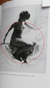
Robert Demachy ” Academie “.
The implied circular posture of the nude model gives structure and poise to the image and mirrors the circular shape of the model’s hair style.
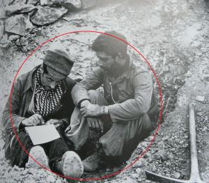
Below: One of Robert Capa’s many war-time photographs shows loyalist soldiers during the 1936-7 campaign Spanish Civil War finding time, while preparing for attack, to write letters. (Published in Images of War London 1964).
This poignant image of the Spanish soldiers shows a clear circle by implication which emphasises and encloses the unimaginable feeling of inevitability that the soldiers must have felt.
What I have Learnt
The enclosing and imposing qualities of the circle.
4: colour. project 30.
October 18, 2009
colour control
Up until now whilst doing this course I have always used Aperture Priority Control on my bridge camera with the exceptions of projects 4 and 5 where I used Shutter Speed Priority. For this project I will have full manual aperture and shutter speed control in order to have ultimate control of the amount of light entering the camera. The brief for this project was to choose a strong definite colour and for the colour to fill the viewfinder frame. I chose my front door which is a strong colour of dark green. I shot a sequence of 8 photographs. The 1st shot was manually set at f/5, 1/20sec ( the exposure that my camera recommended), then I took 3 further shots in 1/3 stop increments enlarging the aperture, and finally, I took a further 4 shots starting at an 1/3 stop increments above f/5 decreasing the size of the aperture. Below is the result of the shoot:-
f/3.6, 1/20sec f/4, 1/20sec f/4.5, 1/20sec
f/5, 1/20sec f/5.6, 1/20sec f/6.3, 1/20sec
f/7.1, 1/20sec f/8, 1/20sec
What is self-evident in looking at the sequence of shots is the illustration of the over-exposure and the under-exposure variance. But it is more significant that the colour of green changes from bright to dark. I was very surprised to find that the shot which was taken at f/7.1 ( 3 third stop increments higher than f/5 ) was the nearest in terms of brightness to the actual colour of my front door. Also, I particularly like the strength and richness of the green that was set at an aperture of f/8. Often, photographers will deliberately under-expose by a third or half stop increment in order to make certain colours darker and so stronger.
Unfortunately, I do not have an image-editing program, so I was unable to note the difference between the darkest and the brightest of the images.
what I have learnt
Full manual exposure allows one to experiment with the strength of colour.
3: elements of design. project 29
October 15, 2009
applying the elements of design
The aim of this project is to incorporate the insights that I have learnt so far on the course into a set of photographs directed towards the subject of flowers and plants:-
curves
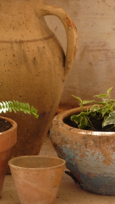
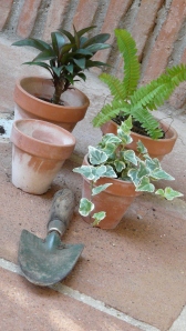
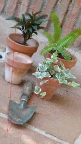
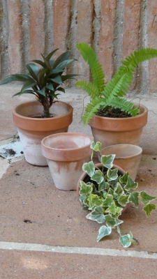
I gathered a few garden pots together and placed them in such way that the composition of the shot would not emit the sense of formality, but rather the sense of being natural and unadorned in order to accentuate the qualities of the numerous curves within the composition. Also, there were soft rays of light falling on the area of the scene to give further life and warmth to the rustic terracotta theme. The curves within the shot instil the sense of beauty and smoothness. I feel that there is plenty of movement and direction in the image as ones eye is encouraged to investigate the various lines of the curves. The handle of the large terracotta pot sits nicely on the rule of thirds intersection giving its appealing curvature prominence and giving overall harmonious balance within the shot. The beautiful natural colours of the pale green and terracotta give warmth and visual unity. The pale blue paint on the ivy pot adds charm and interest.
On the negative side, I do feel that the illusory flatness of the pot in the background on the right of the shot could give the viewer a feeling of an unwelcome void within the image.
distinct, even if irregular, shapes
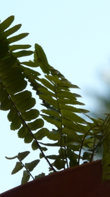
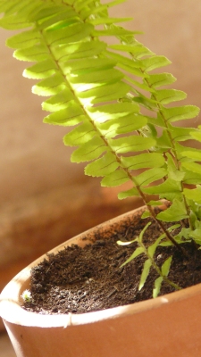
For this shot of the Fern in the Pot, I wanted the light to strengthen the shape of the delicate stems and leaves. In order to attain this I placed the pot on the table of our terrace so I would be able to take the shot facing the brightness of the sun and sky. In order to achieve a shallow depth of field to obscure background distractions and to highlight the fern, the aperture was set at f 5/6 and the focal length was set at 415mm.
The tilt of the camera creates a triangular shape of the terracotta pot giving the shot shape and order. The distinctive thin black stems of the fern are effectively highlighted and give the image an attractive striking influence. The oval and triangular shapes of the fern’s leaves are nicely defined giving the viewer of the image interesting detail to explore.
a single point dominating the composition
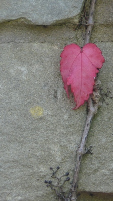
The single crimson leaf of the Virginia Creeper sits close to the top,right side of the image thus giving connection to the frame. The grey stem of the plant leads the eye to the interesting heart shaped leaf even though the line blends with the Yorkshire stone wall. These two points of connection avoid static within the single point image.
2 points within an image
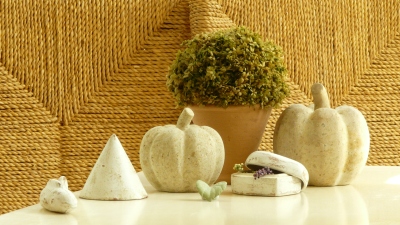
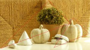
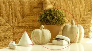
In this image of the pot-pourri I attempted to resolve any unwanted tension within the image by positioning one single point along with a collection of 3 items as another single point in order to attract more attention to the latter and to give the image additional interest. I am not sure that I succeeded as my eye tends to be attracted equally to both points within the image. Yet, the single leaf does point towards the collection of three which gives the image movement and indicates a relationship between the two points.
diagonals
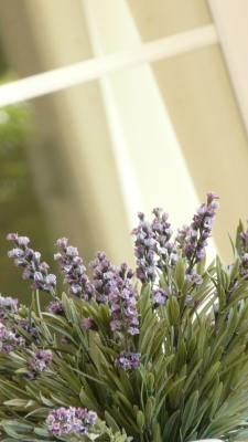
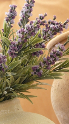
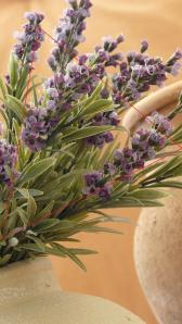
The three images above which I took in my garden in Spain illustrate the dynamic qualities of the diagonal line. The image of the lavender is particularly striking as the white line of the window leads the eye to the lilac flowers in a very dramatic fashion.
implied triangles (with reference to real triangles)
This section of the project is aimed at implied triangles, but I felt that it was useful to note the effective part that real triangles play in this shot.
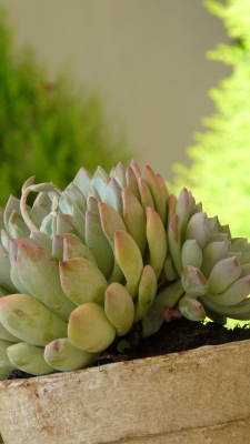
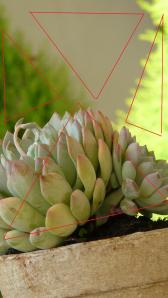
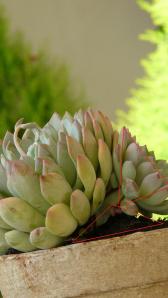
Shape gives an image a sense of order and structure. When taking the shot above, I had played with the perspective of the shot and searched through the viewfinder for background structure, in the form of shape, using the background’s shades of colour. As you can see from illustration (a) below, there are three real triangles and one implied triangle within the shot. The three real triangles in the background, all of which have been formed using the edge of the frame, play a major rule in giving this image a sense of order and clear structure. The centrally placed inverted triangle, the shape of which is distinctively defined by the adjacent triangles, also directs the eye to the beautifully formed plant giving the shot interest and movement. The implied triangle of the plant itself is emphasised by the encroachment into the edge of the frame which removes some of the curvature of the plant.
To summarise, the overall impression that the image emits is simple, tidy and structured. An impression that is gained by using the shape of the triangle which can be frequently found and very useful in the world of photography.
Below, in illustration (b), I have highlighted further triangles which could be interpreted within this image, which illustrates the abundance of triangles that can be found within a potential photograph.
illustration (a) illustration ( b)
The picture of the lavender below illustrates another example of a triangle by implication. The shape of the triangle adds structure to the image and the triangular formation of the lavender stems are highlighted against the curvature of the pots.
several points in a deliberate shape
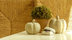
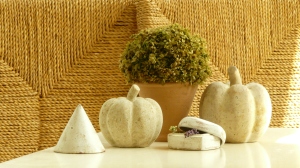
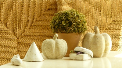
The photograph above illustrates how several points can be easily organised in such a way to form a shape thus giving structure to the image. In project 19 (multiple points), I arranged several points which culminated in an image which I named “Basket Weave Garden”. Below is one of the pictures of the shoot and the summary that accompanied the shot :-
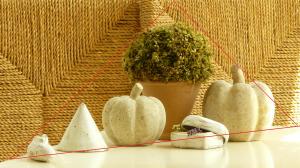
I think that the final image is very pleasing to the eye and the triangular theme is very evident ( as shown in the diagrams below). There are also triangular shapes in the chairs ( and a triangular object) that interact well with the triangles formed by the objects. Also there are many curves and circles within the shot ( the curves of the stone fruit, the fish, the box and the group circle ) which instill the sense of softness and poise. The large triangular shape and the line of the table lead the eye along the line of the objects giving the viewer many points of interest.
a combination of vertical and horizontal lines
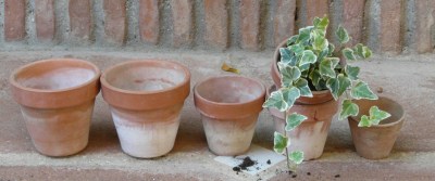
Two of the graphical qualities of the horizontal line of terracotta pots and of the vertical terracotta bricks are depicted in the above image which was taken in my garden in Spain. The horizontal line of the pots lead the eye along its length to the falling ivy in the penultimate pot. The vertical lines in the background give direction towards the line of pots and towards the compact circles of the pots.
pattern
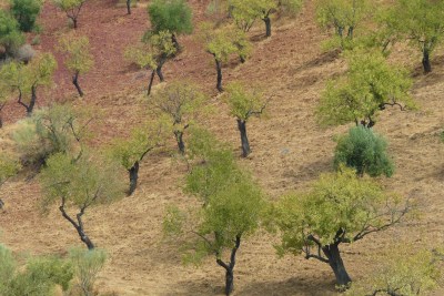
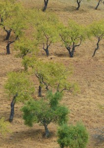
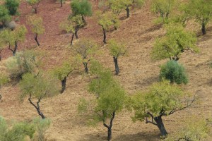
Repetition has a very strong appeal to the human eye, particularly when it is unfamiliar to the viewer. The formation of the olive trees and the expanse of terracotta earth together with their appealing wispy undertones of colour create an attractive pattern within a large area. Also, the seemingly sooty black trunks of the trees add visual impact to the pattern. The placing of the trees is irregular, but their close grouping gives an impression of decoration to the viewer.
rhythm
The plan for this shot was that the lined pattern on the basket should lead the eye, both horizontally and vertically, by means of rhythm, towards the black pot.
what I have learnt
I have found this project to be extremely effective in increasing and establishing the knowledge that I have learnt so far in the art of photography.
my diary: post 6
October 7, 2009
3: elements of design. project 25
October 6, 2009
rectangles
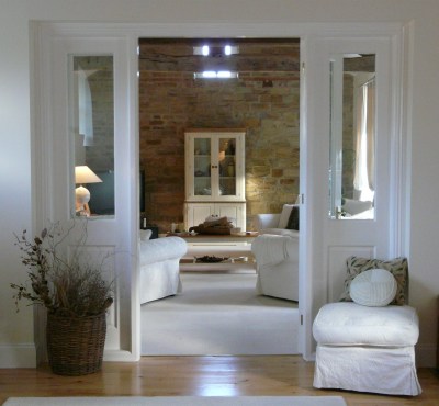
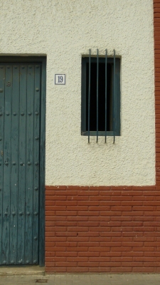
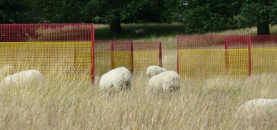
In the same way that lines have certain associations, so do specific shapes. In general, rectangles made up of both vertical and horizontal lines, instill a sense of being formal, enclosing, precise and static. Below are three pictures that I took to illustrate the qualities of rectangles.
The symmetrical representation of the rectangles shown in this picture certainly permeates the sense of order. Yet, this order is eased by the softness of the soft furnishings. What is particularly noticeable is the sense of enclosure that each rectangle of the doors and glass panels emit. There is no feeling of static in this image as the eye is encouraged to move from one rectangle to another. Also, the large rectangular door opening frames the cream cabinet in the background which in turn gives the image a sense of depth.
This picture of the door and barred window instills a very strong sense of being formal and precise. Yet, the image evokes a lot of interest in the varied representations of the rectangle in the red brick, iron bars and the dark smoky blue wood. Also, the small representation of the square (the number 19 plate) accentuates the qualities of the rectangle.
The red and yellow rectangular wire sculpures certainly look very static placed amongst the grazing sheep, but the overall image offers movement in the diagonal positioning of the sculptures and in the added interest of the grazing sheep and the contrasting trees in the background. Also, yet again, the formal representation of the rectangle is soothed by the softness of the countryside in which they are placed.
what I have learnt
The general qualities of the shape of the rectangle.
3: elements of design. project 20
October 5, 2009
horizontal and vertical lines
This project explores the properties of vertical and horizontal lines. In particular, we are looking at obvious vertical and horizontal lines that are the priniciple focus point of the image as opposed to lines by implication or lines that are edges of objects that normally appear as a contrast against a dark background or vice versa.
When out and about with my camera looking for shots for this particular project, I noticed plenty of vertical and horizontal lines – buildings, steps, roads, horizons, shorelines etc…, yet looking for these lines as a principle subject for an appealing image proved to be more challenging. The images below demonstrate the qualities of vertical and horizontal lines and are portrayed as the main point of interest.
pic 1.
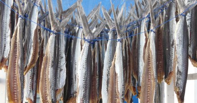
This image portrays the hanging and drying of the voladores ( flying fish). They are considered to be a delicacy in the area of Estepona and are eaten when having being taken through a lengthy process of many weeks of drying. They are brought out into the open air each morning on their hanging frames in the port of Estepona. The vertical lines in this picture have a very striking impact on the viewer of the image and together with the beautiful blend of colours silver-grey, peach and blue make an impressive shot. It is also interesting to see how the vertical lines also lead the eye to the blue string and the visually pleasing shape of the fins.
pic 2
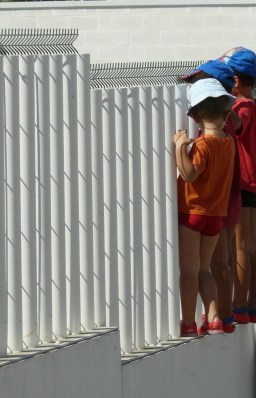
This picture is most certainly a picture of lines! Vertical lines, horizontal lines, diagonal lines and boy lines! I love the harshness of the vertical metal railings against the softening effect of the horizontal soft shadows, the colours and the boys and their hats.
pic 3
The vertical lines of the El Corte Ingles store in Puerto Banus have a very dynamic presence in this shot and again lead the eye to the glorious blue sky and the aeroplane’s vapour trail.
pic 4 and 5
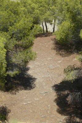
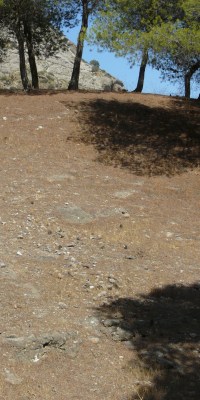
I had to include trees in my collection of vertical line shots as I found that trees were one of the most common sources of vertical lines. But what I find fascinating about these two images is that the perspective of the shot and the implied line (pathway) lead the eye to the beautiful highlighted lines of the tree trunks giving them centre stage in the image.
horizontal lines
I find that horizontal lines are less pleasing to the eye than vertical lines. They have more of a static presence in an image as apposed to the moving and striking attributes of the vertical lines. I also find that the placing of an horizontal line in an image has to be carefully considered as its presence can culminate in an unwanted division within a shot.
pic 1
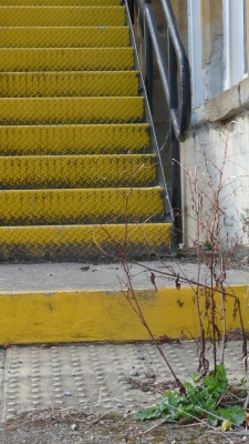
Steps are a good source for horizontal lines. In this shot of the ill- maintained yellow metal steps, the static presence of the horizontal lines of the steps is alleviated by the implied horizontal line leading from the weed in the bottom right hand corner through to the black handrail.
Pic 2
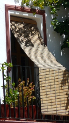
The horizontal lines of the window blind are softened by the shadows of the plants.
Pic 3
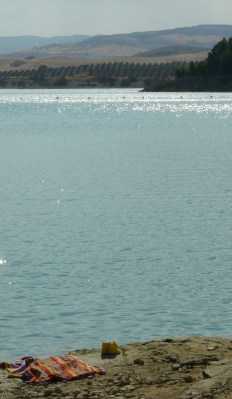
This shot of Lake Guadalhorce in Andalucia shows horizontal lines in the horizon, the row of trees and the row of buoys. Also the current of the water implies horizontal lines. I do feel that this picture lacks a sense of movement because of the strong representation of the horizontal implication.
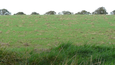
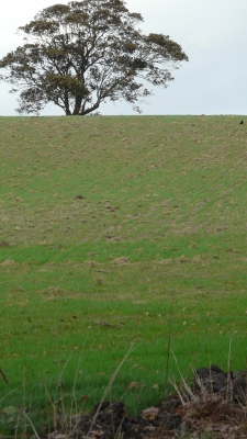
pic 4 and 5
I find that the horizontal line in the above images has a very dominant presence and is certainly a platform for the trees. In the first image the row of the tree tops softens the horizon line whereas in the second picture the roundness of the one tree top accentuates the dominance of the horizon giving the image a very clean and geometric persuasion.
What I have learnt
The appreciation of the visual effects that horizontal and vertical lines portray.
3: elements of design. project 21
October 4, 2009
diagonals
Many scenes contain horizontal and vertical lines whereas diagonal lines are far less common. But diagonal lines can be created rather easily by adjusting ones viewpoint of horizontal and vertical lines. Below, are the effects that diagonal lines can portray in the images that I shot for this project.
pic 1
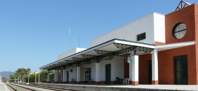
The diagonal lines in this shot of La Linea Station lead the eye into the distance giving the shot great depth.
pic 2
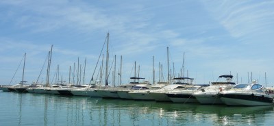
The image of the row of yachts in Puerto Banus was taken at an angle in order to attain a horizontal perspective.
pic 3
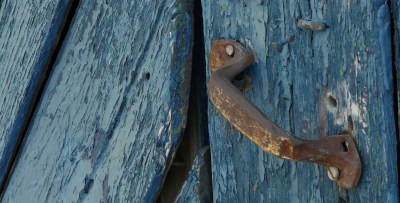
The image of the old blue door and rusty handle portrays a theme of diagonal lines which are much harder to find in our towns and streets than horizontal and vertical lines .
pic 4
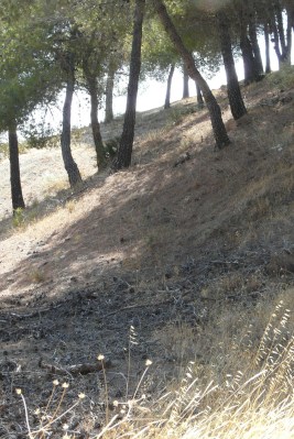
A naturally occuring horizontal line as shown in this line of trees has a striking effect in this image.
What I have learnt
The effects that the horizontal line portrays in an image.
3: elements of design. project 24
October 3, 2009
shapes
A shape is both an outline and an enclosure. The extent to which a shape appears as a shape or an enclosure depends very much on the subject and the lighting. Shape, ultimately, defines an object, but it can also be implied in much the same way as a line can.
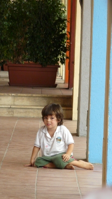
The posture of the little Spanish boy with his leg stretched and his foot pointed illustrates an implied shape of the triangle. Shape gives order and interest to an image.
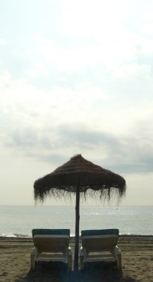
Light plays a major role in strengthening shape. The above picture of the sun chairs and the straw parasol shows how the camera facing towards the sun gives a high contrast between the background and the subject, accentuating the triangular shape of the parasol and the rectangular shape of the combined sunbeds.
Notes
- Shape defines an object
- Shape can be implied
- The more regular a shape appears, the stronger the part it plays in the composition
- contrast, either of tone or colour, can define a shape
- A high sun from behind the camera lights up a shape as intensely as any form of light can especially against a clear sky
- Silhouette -the sun facing the camera gives the highest contrast possible between the background and the subject
What I have learnt
The various ways in which shape can be implied and can be defined in an image.
3: elements of design: project 23
October 1, 2009
implied lines
In an image one needs only a few suggestions of visual clues to imagine a line. Listed below are the most common such clues:
- A row of points ( objects)
- The extension of a line/lines that seem to point in a certain direction which encourages the viewer’s eye to move ahead.
- The extension of visible movement, such as a car being driven or a person walking, again, encouraging the viewer’s eye to move ahead.
- The direction in which someone in the picture is looking. The viewer’s eye tends to go to the same place, known as an eye-line.
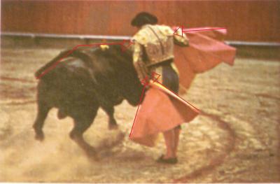
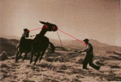
These imagined lines are known as implied lines. For the first part of project 23, I will attempt to identify the implied lines in the two images below, the bullfighting image and “Threshing Corn in Sicily” by Gotthard Schuh.
The bullfighting images show the 4 lines that direct the viewer towards the Matador.
In this image the direction which the horses and farmer are looking ( the eye-line) directs the viewer’s eye back and forth in order to explore each subject of the image.
For the 2nd part of this project I shall perform the same analysis in 3 photographs of my own :-
In this photograph of the magnificent stallion, the implied line formed by the trees to the left and the curved branches of the tree to the right direct the eye to the main point of interest.
In this shot taken in the beautiful countryside of Andalucia, the implied lines formed by the olive trees together with the line of the fence lead the eye to the charming finca.
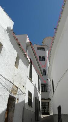
Finally, the picture above taken in Ojen, shows the lines of the eaves pointing to the interesting windows in the central building.
For the 3rd part of the project, I planned and took 2 photographs that use an “eye-line” and lines that point :-
lines that point
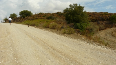
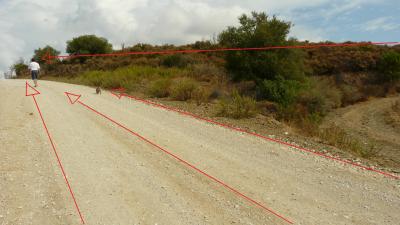
For this part of the project I thought that I would have my husband, Julian, and our little dog, Chica, as the points of interest in the shot.
On our walk I noticed that the track that we were about to ascend had a couple of track lines leading towards the brow of the hill, along with a triangular shaped area of scrub land to the right which was also pointing towards the brow of the hill. Julian and Chica walked ahead and as they approached the brow of the hill I took the shot :-
eye – line
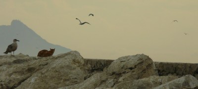
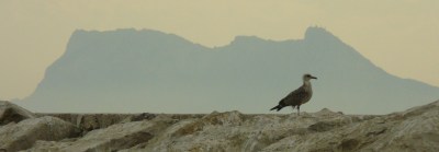
Later in the day we moved on to Estepona Port where we sat on the harbour wall to watch the fishing boats coming into the port carrying the afternoon’s catch. In the distance I saw a cat and a seagull perched on the harbour wall, almost silhouetted against the rock of Gibraltar. There were many more seagulls filling the sky above them. I took many pictures hoping that there would be some kind of visual connection and, indeed, the seagull on the harbour wall does appear to be looking towards the cat. What’s more, the seagull in the sky is pointing towards the cat and the seagull :-
What I have learnt
Implied lines within an image lead the viewer’s eye to different points of interest within the shot which in turn gives the image a sense of movement and energy.
3: elements of design. project 22
October 1, 2009
curves
Another of the continuous lines in an image is a curve. Curves can bring the feelings of smoothness, grace and elegance into an image. Curves also have a sense of movement and direction.
pic 1
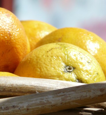
In this picture the curves of the oranges instill the sense of smoothness and calm.
pic 2
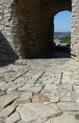
The curve of the arch against the harshness of the stone adds poise to the image.
pic 3
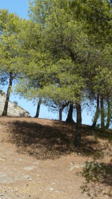
In this shot the eye is persuaded to investigate the line of the curve.
pic 4
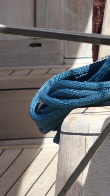
The curves of the blue rope contrast beautifully with the various straight lines within the shot.
What I have learnt
The appreciation of the qualities that curves can give to an image.
my diary: post 5.
September 26, 2009
For this diary post I really don’t know where to start!
Firstly, I can tell you that Assignment 1 has been completed, posted to my tutor and my tutor has reported back to me with a detailed report of my work! I had been very anxious about receiving the first critique of my work, but I was very pleasantly surprised to find that my tutor thought that overall I had produced a very competent piece of work! Norman ( my tutor ) had obviously studied my work in great depth. His constructive comments and critique of my work will prove to be very useful for further projects and assignments.
Now that I have assignment one behind me and I have had confirmation that I have an eye for an image, I feel that I have been injected with a very welcome boost of confidence and energy! Looking back at my last diary post I must confess that I sounded pretty tired and dispirited. If anybody is reading this and is thinking about doing a similar course, I would recommend it all the way, but don’t think for a minute that it would be an easy ride! If you really want to learn about the art of photography one has to put their all into this course! You have to have a love for the art, you have to work very hard and you have to be prepared for the ups and downs. If you take all this on board you will be well rewarded with great insight into the wonderful world of photography.
I am about a quarter of the way through the course and my knowledge and understanding of the art of photography has increased tenfold. I have started to look at an image completely differently to how I would have looked at an image before. A good shot is not just a “good shot” anymore – it has so much more to offer and appreciate! The appreciation of the composition of a shot, the way objects are placed within an image, the light and the use of colours, lines and shapes. The appreciation that the photographer behind the camera has such skill and talent. The appreciation of the different styles, techniques and approaches to taking a photo that various photographers have. It is so exciting to think that I have so much more to learn!
Since posting my last diary I have been to England. We have a very beautiful park next to us. I spent a couple of hours in the park just taking photos- not thinking about assignments or projects, just me with my camera. I enjoyed it so very much and took some good shots. But, more importantly, I felt a lot more at ease with my camera, and strangely enough I seem to see so much more within the landscape and within my surroundings than I ever did see before. Learning about the art of photography certainly teaches you to open your eyes and appreciate the beauty that our planet offers!
Hasta luego
Robina x
P.S. Lets hope that I am on an up and not a down on the next post!
2: the frame: project 13
September 26, 2009
the golden section
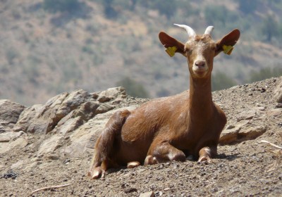
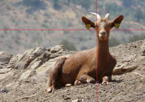
Balance can be obtained by using the Golden Section which does not have to be measured or adhered to exactly – it is merely a guide which proves to be very helpful for composing a composition. The lesser is to the greater as the greater is to the whole is the rule of the Golden Section. A simple approximation of these proportions is the Rule of Thirds – basically, divide any rectangle into 9 sections – 2 lines across and 2 lines down. The crossing point of each line provides points, any one of which can be a main focal point in an image. The Golden Section theory appeals to most people’s sense of balance therefore creating harmony when viewing an image.
My images below show the approximate proportions of the Rule of Thirds and the all important crossing points.
pic 1.
As you can see in the picture of the goat the main point of focus ( the goat’s face ) is positioned on the Rule of Thirds intersection.
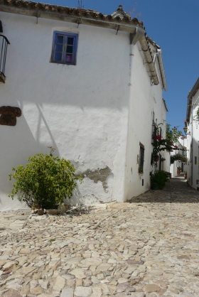
pic 2.
In picture 2, taken in a spanish village, the all important intersection point is at the corner of the white painted house which divides the picture into the approximate harmonious sections of the Golden Rule.
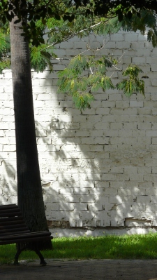
pic 3.
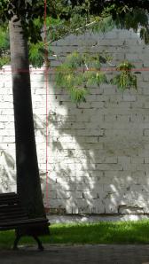
The tree and White Stone Wall picture demonstrates the principle of the Golden Section.
pic 4.
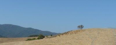
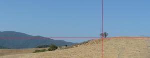
Picture 4, Andalusian Tree, Shows the Golden Section principle and the main point of focus (the tree) sits beautifully on the intersection point.
pic 5
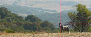
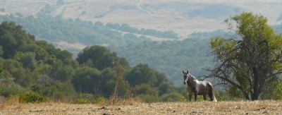
This picture taken of a spanish stallion illustrates the all important intersection point of the Rule of Thirds which crosses at the exact point of the main point of interest.
pic 6.
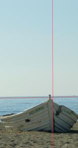
This picture taken without conscious calculation of the Golden Section shows that the vertical piece of wood on the bow of the boat lies on the intersection point, and the horizontal line of The rule of Thirds runs with the line of the horizon which is a clear indication that the division of the image is close to the harmonious division of the Golden Section.
what I have learnt
Creating balance in an image is fundamental to achieving visual harmony and the Golden Section and/or the Rule of Thirds are effective ancient theories which photographers should consider when taking a picture.
useful learning material
www.photography-now.net/listings/index.php?option=com_alphacontent§ion=29&Itemid=293 is a fantastic website that has many images taken by world renowned photographers – great material for exploring the division of the frame in photography.
3: elements of design. project 19
September 26, 2009
multiple points
A grouping of objects provides a network of lines and can also create shape – by implication. In still- life photography one of the three basic skills is to be able to group objects together in such a way that they are linked attractively and in a relationship that is active rather than obvious and static.
Below is a sequence of photographs that culminate in the final shot of my still-life ” Basket Weave Garden”. The items that I selected from around the home for the shoot blended together in colour, texture and theme (garden association). I would place the objects one by one on our kitchen table. I had pushed two kitchen chairs together in order to create an attractive background that would marry well with the still-life shot that I wished to create. The sunlight was coming through the window to the right of the shot which would give the composition life and softness.
I used a tripod and set the camera as follows: f7/1, shutter speed 1/40sec, focal length 292mm, iso 200.
I think that the final image is very pleasing to the eye and the triangular theme is very evident ( as shown in the diagrams below). There are also triangular shapes in the chairs ( and a triangular object) that interact well with the triangles formed by the objects. Also there are many curves and circles within the shot ( the curves of the stone fruit, the fish, the box and the group circle ) which instill the sense of softness and poise. The large triangular shape and the line of the table lead the eye along the line of the objects giving the viewer many points of interest.
What I have learnt
Shapes and lines are one of the basic requirements for producing a good still-life image.
2: the frame. project 14
September 16, 2009
vertical and horizontal frames
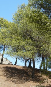
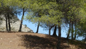
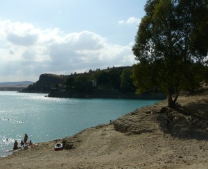
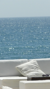
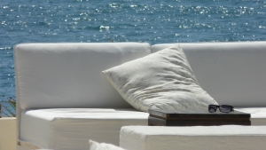
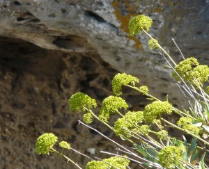
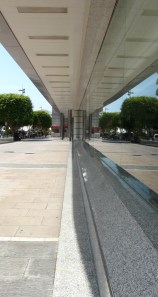
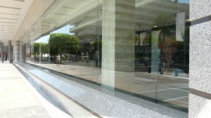
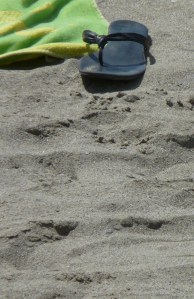
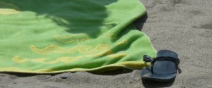
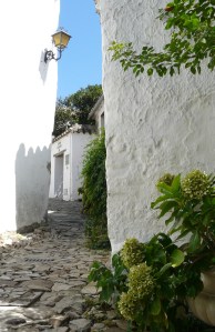
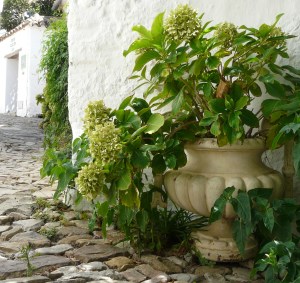
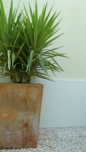
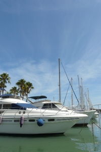
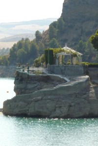
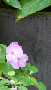
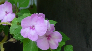
I find that I often experiment with horizontal/vertical frames – whether the subject is tall or is short. A lot of the time a subject will suit both types of frames. In some cases, I may alter the angle slightly, and sometimes the focal length. Below are some of the photographs that I have taken with horizontal and vertical frames.



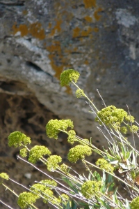

3: elements of design: project 18
September 15, 2009
relationship between points
Project 16 and 17 dealt with the relationship of a single point to the frame. The single point was related to the frame in the absence of there being any other point to connect to. When there are 2 points, however, the relationship between the two dominates the composition.
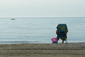
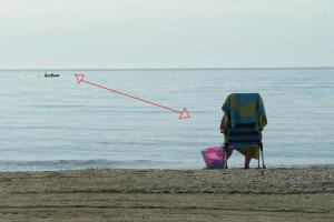
The picture of the lady and the boat illustrates, with the marked implied line, the relationship between the two points. The eye is drawn from one to the other, in turn, giving direction and movement to the image. More often than not, one point attracts more attention than the other. In the picture above the seated lady attracts more attention as she is nearer and therefore larger than the boat in the distance. If there are two points in an image of the same size this can create unresolved tension which can damage a composition.
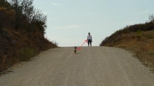
The image above of Julian and Chica probably would have better illustrated the concept of the relationship between two points if there had been a greater distance between them.
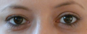
Coral’s eyes are attracting equal attention, which gives the image no movement and an unresolved tension.
What I have learnt
The effects of the positioning and of the interaction of two points within an image.
3: elements of design. project 17
September 15, 2009
Positioning a point
This project experiments with the positioning of points. There are essentially 3 classes of position in which to place a point:- middle, a little of centre and close to the edge. Placing a point in the middle, in most cases, gives an image a feeling of being static :-
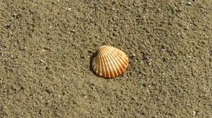
The shell is placed in the middle of the frame so having no connection with the frame of the image. It’s placement is final and static.
In this image of the shell the red lines illustrate the connection between the shell and the frame thus giving the image more life.
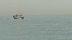
I think that the sense of movement is more clearly illustrated in this image of the fishing boat. The boat is placed in a position whereas the eye connects to the intersection point between the boat and the frame thus allowing scope for the rest of the image to be explored. In addition, the boat is also pointing towards the far, bottom right hand side of the frame again adding energy to the shot.
What I have learnt
As also illustrated in the positioning of points in my images in project 16 consideration between the frame and the subject is crucial to avoid an image being static.
3: elements of design. project 16
September 14, 2009
defining a point
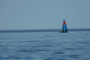
Possible situations which would make a clear photograph of a point; a tiny flower against the grass, a bird in flight against the sky, a brightly coloured roof in a vast open field, a beautifully formed colourful shell on sand, a tiny island against a vast ocean, a polar bear or seal in the snow, a group of colourful balloons against the sky, a small oasis in a desert, a lilac crocus in the snow, a tractor in a field, a water lily in a pond, a colourful umbrella against a sea of people, a childs face in a sea of colourful balls, a lone tree in a sea of mist, a climber on a rock face.
Possible ways in which lighting alone can create a point; the moon in a starlit sky, a face or figure illuminated in a dark room, a spot of light lighting up an object against a dark background, an old lantern illuminating a small area, a small area ot interest outside a shaded area.
My photographs that illustrate a point;
